A selection of recent client work and concept builds. Some projects aren’t shown publicly — happy to share more on request.
SELECTED WORK
Across industries, scales, and styles
Hospitality, heritage, e-commerce, and brand websites — each built around what the business actually needed. Click any project to learn more.
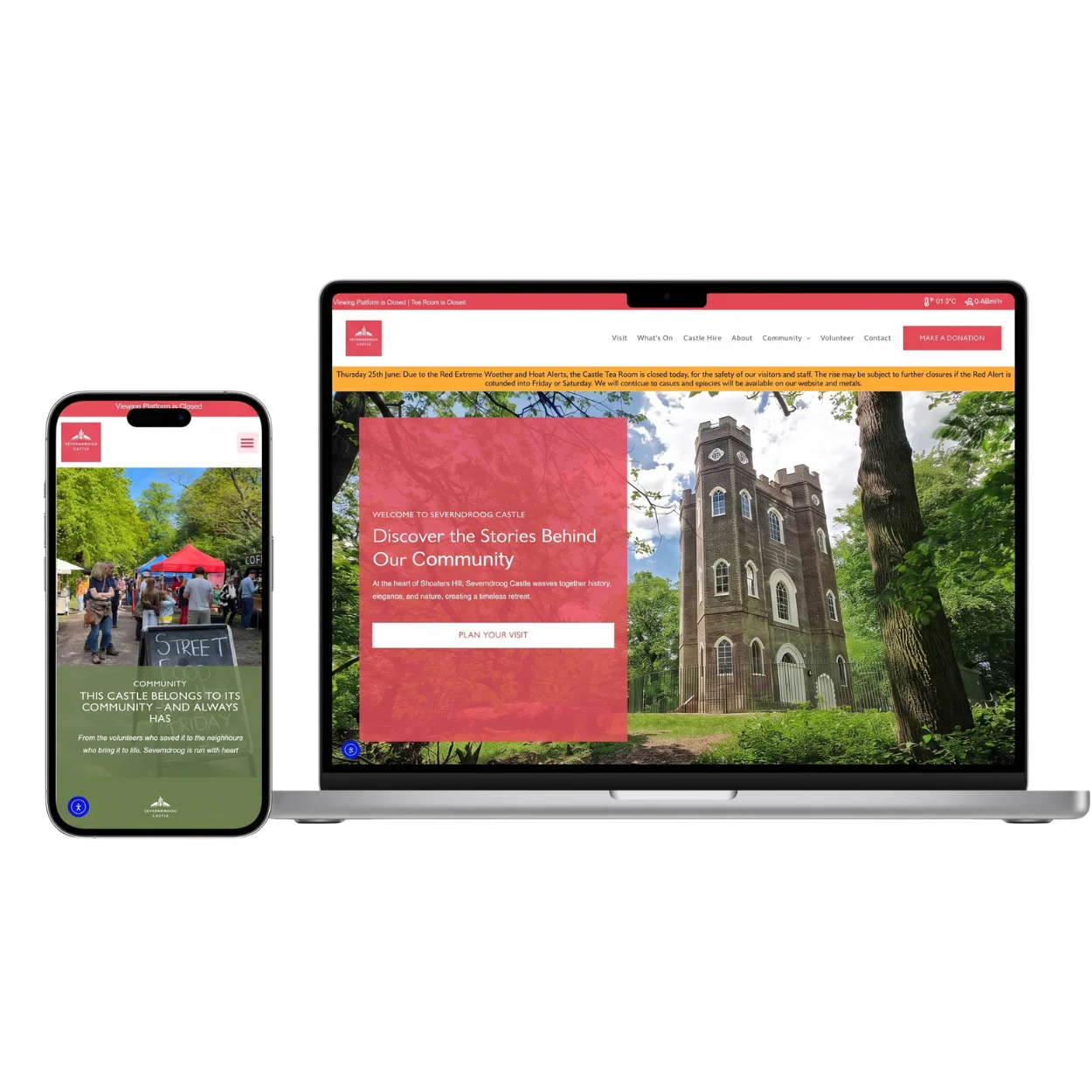
CASE STUDY — HERITAGE
Severndroog Castle, London
A Grade II*-listed 18th-century castle in Oxleas Wood, run by a small charitable trust managing public tours, private hire, and an active events programme.
What you get
THE BRIEF
The trust needed a website that could properly tell the castle’s story, act as a directory for visitors and prospective volunteers, and — most importantly — sell tickets to events directly and capture inquiries for tours and private hire.
THE APPROACH
I designed and built a bespoke WordPress site with integrated ticket booking, an events calendar, visitor information pages, and a streamlined inquiry system for tours and private bookings. The editorial, photo-album style design captures the sense of community around the castle. The back-end was structured so the trust can manage events, content, and bookings independently.
result
A 12x return on investment in the website's first year — and growing.
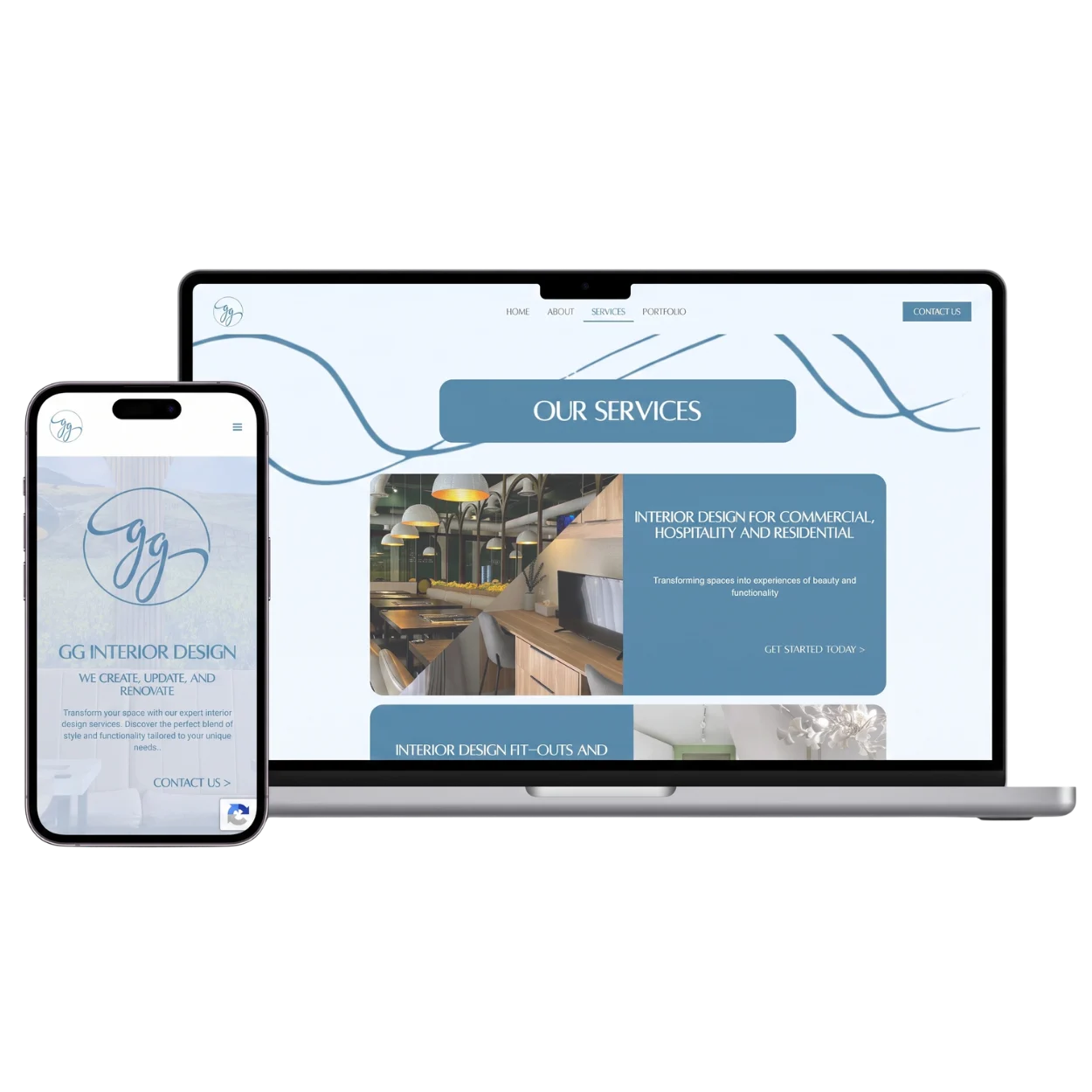
An established interior design studio in Cebu with a strong portfolio of residential and commercial projects, looking to build a stronger online presence and capture more qualified inquiries.
What you get
THE brief
The studio needed a website that could properly showcase their portfolio, rank well in local search, and convert visitors into qualified consultation inquiries
THE APPROACH
I designed and built a portfolio-led site with a visual-first project gallery, dedicated service pages, and a structured inquiry form for new project consultations. The design language is clean and editorial — letting the work itself do most of the talking — and the site was built with local SEO foundations to capture qualified search traffic from the Cebu market.
result
#1 on Google for "interior designer Cebu" — bringing in a steady flow of new client inquiries.
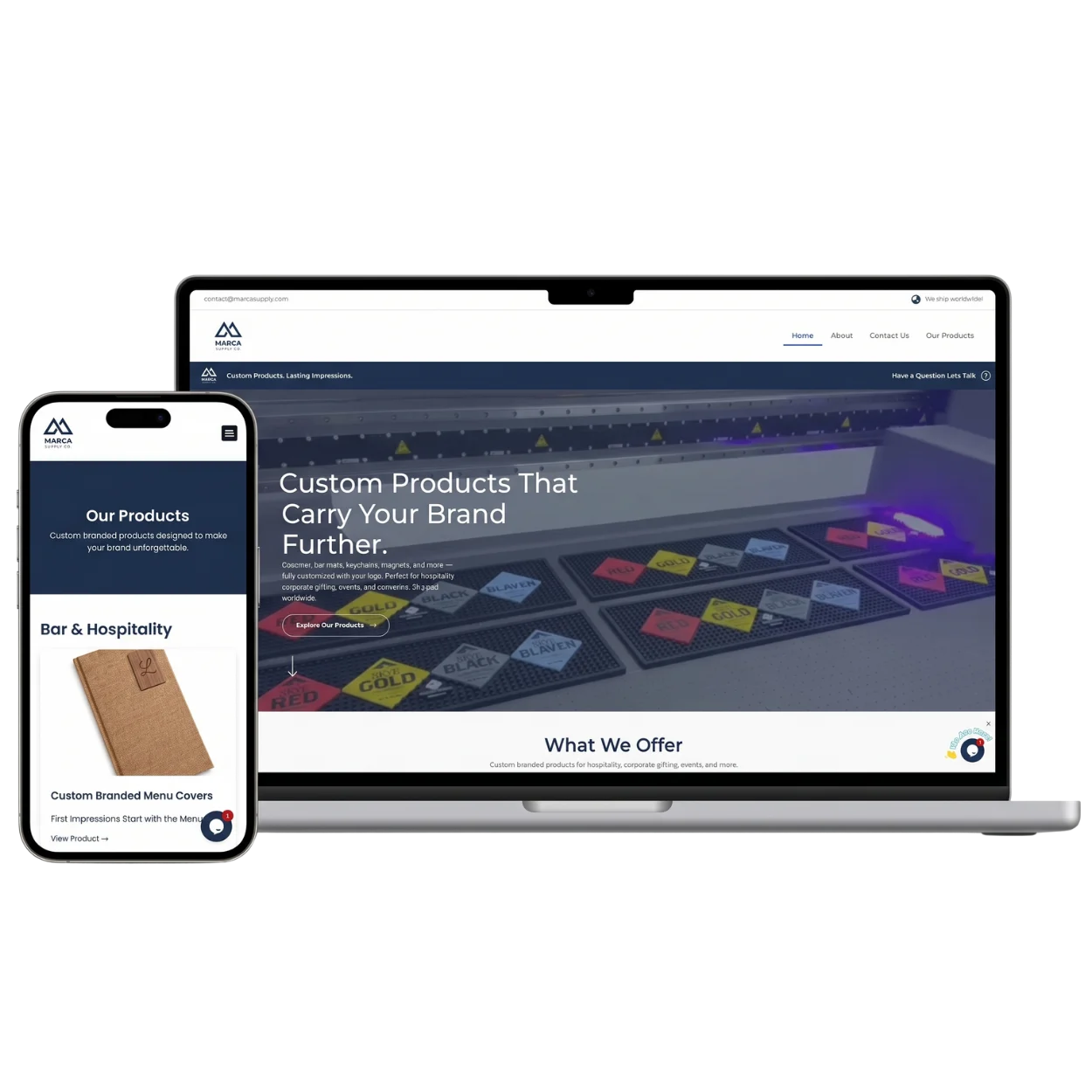
A B2B custom rubber products manufacturer supplying customized branded merchandise.
What you get
THE CHALLENGE
The team needed a website that could take orders and inquiries directly, expand their customer base beyond third-party B2B platforms, and reduce the platform fees eating into their margins — while standing out in a category dominated by generic supplier sites.
THE APPROACH
I designed and built brand-forward site with a structured product showcase, a quote request form, and integrations to capture inquiries directly with a back-end for the team to add products, manage inquiries, and update content independently.
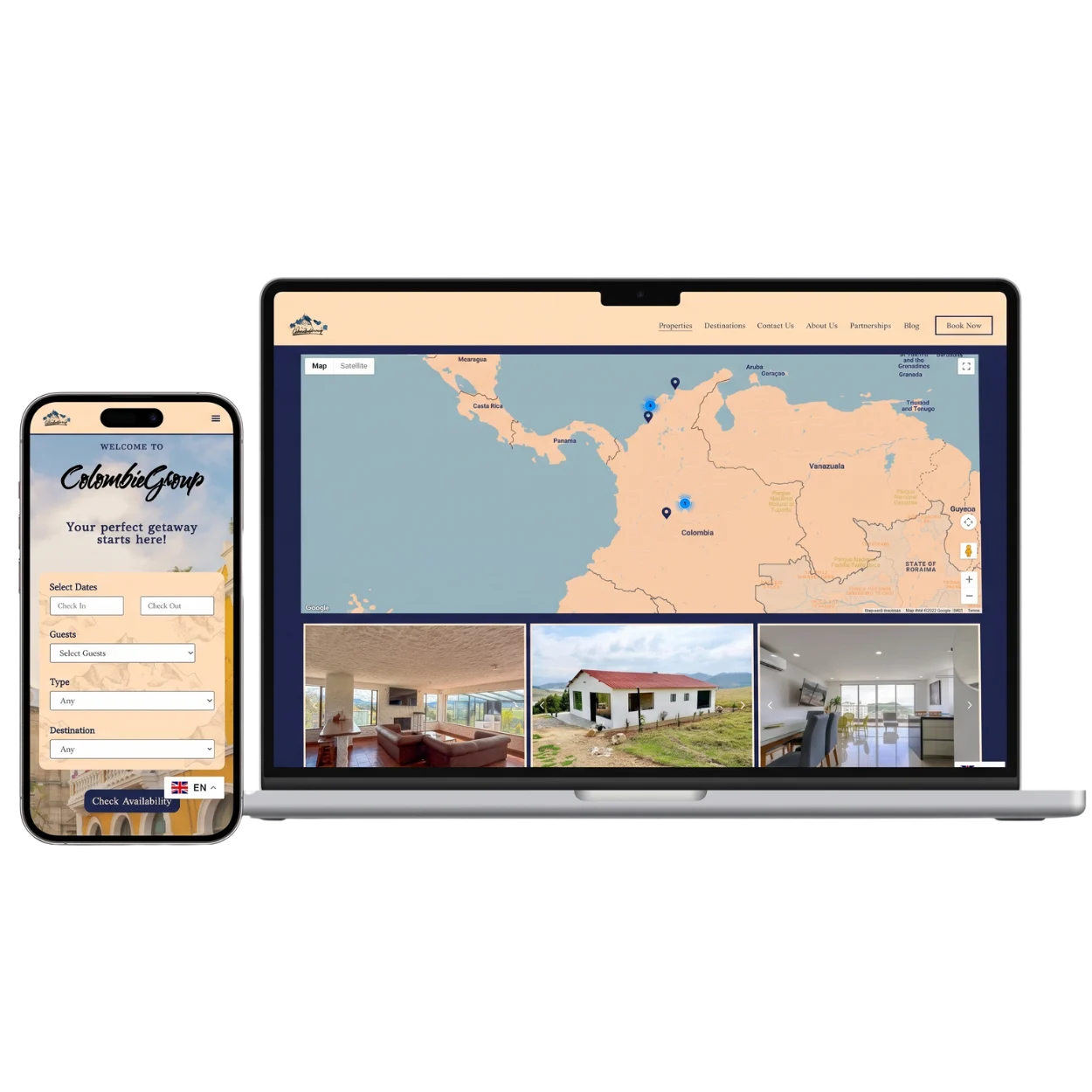
A property rental business in Colombia managing a portfolio of holiday rentals.
What you get
THE CHALLENGE
The team needed an Airbnb-style booking experience built directly into their own website with multi-property management, real-time availability, integrated payments, and a clean guest-facing experience
THE APPROACH
I designed and built a bespoke site with booking and reservation functionality, multi-property management, an availability calendar, and a streamlined guest experience from browsing to confirmation. The system handles inquiries, payments, and bookings without depending on third-party platforms — and the back-end is structured so the team can add properties, adjust pricing, and manage bookings independently.
result
Full booking platform delivered — without third-party fees or enterprise development costs
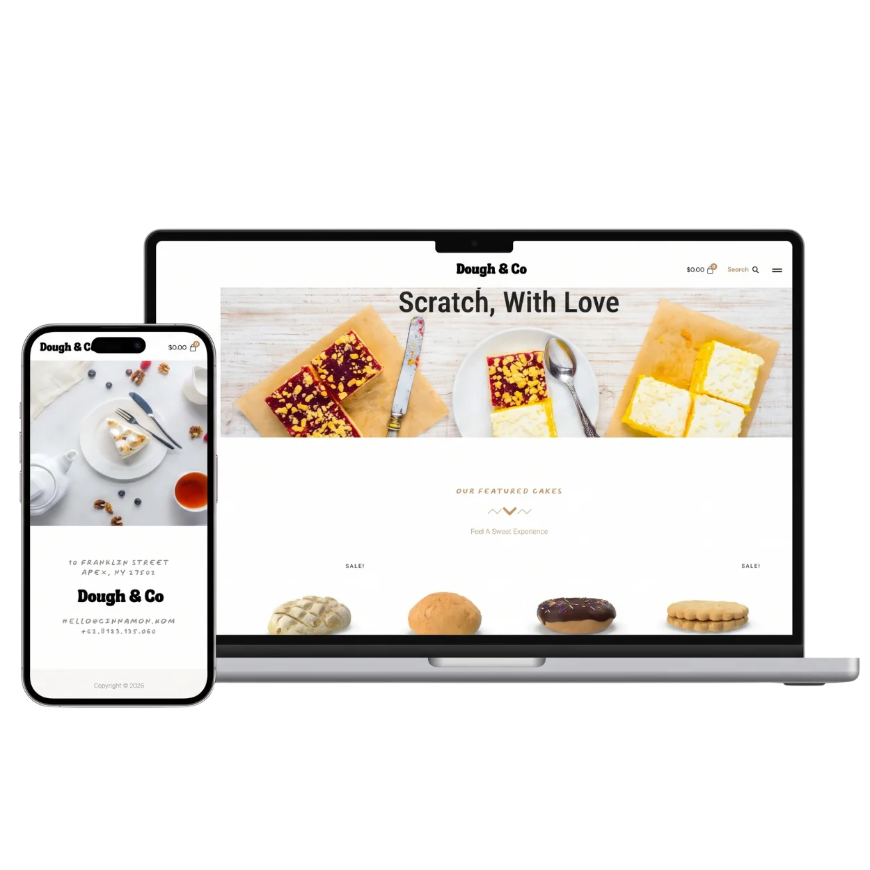
A concept site exploring how an independent bakery could present itself online — built to show how craft, atmosphere, and direct ordering can sit together in one cohesive brand experience.
What you get
THE CHALLENGE
Most independent bakery and restaurant sites fall into one of two traps — either they’re brochure-style sites that lack any commerce or booking function, or they’re commerce-heavy ordering forms that lose the warmth and character of the business itself.
THE APPROACH
A warm editorial design that leads with photography, story, and atmosphere — then quietly handles the commercial work in the background.
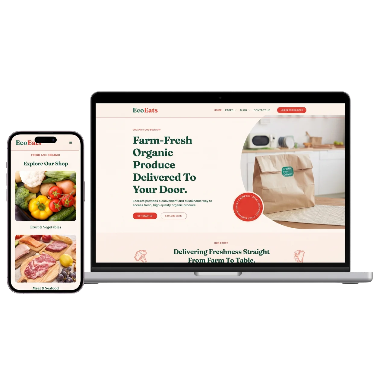
A concept site exploring how a small organic produce business could move from local farmers’ market to direct-to-door delivery — built around a clean shopping experience that puts the produce and USP at the centre.
What you get
THE CHALLENGE
Most organic and produce sites either rely on bloated third-party marketplaces, or run thin Shopify-style storefronts that strip out everything that makes the business distinctive. The design aims retain brand character, and works just as well on mobile as desktop.
THE APPROACH
A full WooCommerce setup organised around how people actually shop for groceries — by category, not by SKU. Clean product cards, simple cart-to-checkout flow, integrated delivery scheduling, and a homepage that leads with story and seasonality rather than discounts. The design lets the product photography do the heavy lifting.
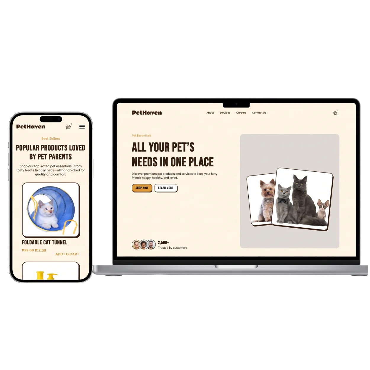
A concept site exploring how an independent pet retailer could build a proper online storefront — designed to enhance experience and brand.
What you get
THE CHALLENGE
Independent retailers face a particular challenge online: big-box players dominate search, undercut on price, and treat every product as an interchangeable SKU. Smaller retailers either disappear into that noise, or sit on weak generic sites that don’t reflect what makes them worth choosing. The aim here was to showcase what independents can strongly offer — curation, care, and a buying experience that feels human.
THE APPROACH
A product-led design that leans into editorial layouts, social proof, and clear hierarchies — best sellers up front, services woven in alongside products, and a checkout flow that feels considered rather than transactional.
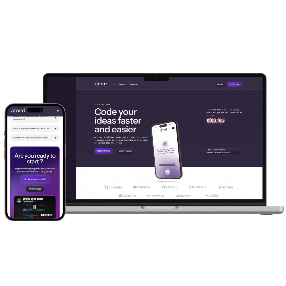
A concept site exploring how an AI-powered developer tool could position itself in a crowded market — built to feel like a serious product rather than a marketing site, with hierarchy, density, and confidence baked into the design from the start.
What you get
THE CHALLENGE
SaaS and AI product sites tend to fall into a few familiar traps — bloated hero sections, vague feature lists, and homepage layouts that try to do everything at once. This design respects the audience (technical buyers who scan fast and know what they want), and uses the page to actually communicate the product, not decorate around it.
THE APPROACH
A dark, dense, product-led design that leads with a clear value proposition and immediately gets to the work — what the tool does, who’s using it, and how it fits into a developer’s workflow.
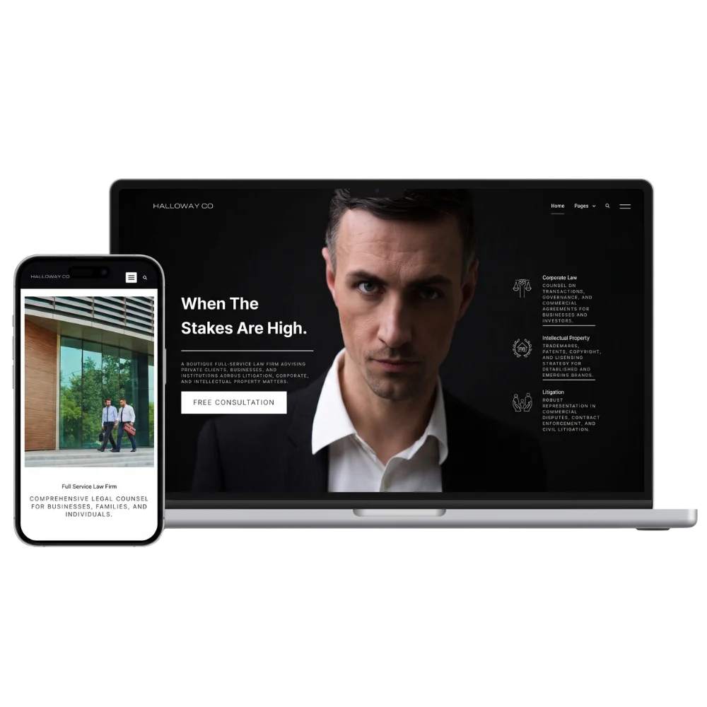
A concept site exploring how an established corporate law firm could present itself online — designed to communicate authority and depth at a glance.
What you get
THE CHALLENGE
Professional services websites have a particular problem: the audience is rarely browsing for entertainment, the stakes are high, and trust has to be established within seconds of landing on the page. Most firms either hide behind corporate sterility, or overcompensate with marketing language that undermines the seriousness of what they do. This targets audience’s attention through substance rather than spectacle.
THE APPROACH
A restrained editorial design built around clear hierarchies — practice areas, named partners, real case outcomes.
"TechHive exceeded all expectations with their innovative IT solutions. Their team quickly identified our pain points and delivered a customized platform that improved our workflows. Amazing!"
John DoeBusiness Analyst
"The solutions provided by TechHive have transformed the way we serve our clients. Their software is robust and tailored to our industry’s needs. The customer support team is always responsive and ready to help. Amazing!"
Michael TerryManager
"TechHive’s cloud-based platform has been a game-changer for our remote teams. It’s user-friendly, secure, and scalable, meeting all of our needs. Their team guided us through every step, ensuring a smooth transition. Amazing!"